On Tuesday Nov. 7 the Hillview Task Force will discuss the pros and cons of 3 Floor Plan concepts created by architects Tam and Noll. Each committee member has had a full week to think about the 3 concepts for the new Hillview Community Center project and to decide which one he or she prefers and why. [ Meeting 7 pm, Council Chambers; note this might be LAYC]. 3-D renderings of possible architectural character will also be presented.
Perhaps Hillview Task Force members will have a clear majority preference for a floorplan…or not. Members will try to persuade each other. Members and public commenters might voice objections to certain details of all the concepts. The architects will take it all in and prepare a semi-final floor plan in a couple of weeks – it probably will NOT BE EXACTLY any one of these three.
Nov, 7 Agenda see item 5.
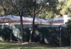
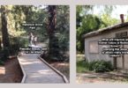
Location of the Project – Site 4
As a reminder, the Hillview Task Force and City Council considered several locations, but decided on Site 4.

The majority of council of the task force members preferred the site 4 location for a variety of reasons. The architect prefers site 4 because it is larger and has a visual connection to downtown
Below are the 3 Floor Plan concepts the Tam & Noll architects prepared last week. [They could change some before the. Nov. 7 meeting of the Hillview Task Force.] Tam & Noll will also be presenting some 3-D renderings of “architectural character” (not shown here)…based on Hillview Task Force and community input up to now. You can take the public survey about “character” on the City website here for the next week.
When Comparing Floor Plan concepts,
think about this
Lalahpolitico: I am going to quote Tam and Noll
The following questions are intended to facilitate Hillview Task Force discussion [thinking]. [Because of the Brown Act, members should not talk among themselves outside of meetings.]
1. In general, which concept resonates with the Los Altos community? Why?
2. Which concept resonates with the intent of a multi-generational Community Center?
Why?
3. Which concept has the best indoor/outdoor potential relationships?
4. Do you like the building entry?
5. The lobby is in the same relative location for each concept. Which works best? Why?
6. The community room is located in different places per concept. Which works best?
Why?

All concepts have the same square footage allocation for seniors, teens, and other uses. San Antonio Road is on the west/left. The baseball field is on the north/top. Hillview Ave., the residential street, is off this map but towards on the bottom/south. See Site 4 image above for orientation.
Nov. 7 Concept A – “Courtyard”
• Plan organization around an interior courtyard with one connecting gallery hallway
•Majority of parking oriented west of building
• Main entry at west elevation, facing San Antonio Road
• Cafe/Lobby/Reception at Northwest corner of site with adjacent outdoor plaza/terrace
• Seniors accessible from lobby and potential independent entry
• Teens with adjacent outdoor space on north side near ballfield
• Kinder prep separate entry
• Community Room at east side of courtyard Adjacent outdoor space potential to both east and west
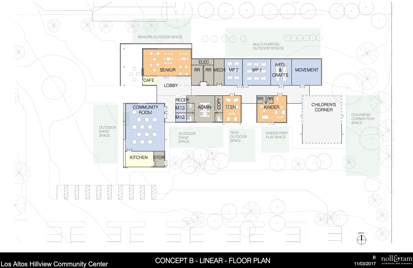
All concepts have the same square footage allocation for seniors, teens, and other uses. San Antonio Road is on the west/left. The baseball field is on the north/top. Hillview Ave., the residential street, is off this map but towards on the bottom/south. See Site 4 image above for orientation.
Nov. 7. Concept B – “Linear”
• Linear plan organization with program spaces all accessible from an interior double- loaded hallway with views out to the south
• Main entry at west elevation with secondary entry from south
• Majority of parking south of community center
• Community Room prominently located off lobby which can be a breakout space for events
• Seniors located northwest corner with strong relationship to the lobby
• Teens with adjacent outdoor space on south side Potential for separate entry
• Kinder prep at south side of hallway

All concepts have the same square footage allocation for seniors, teens, and other uses. San Antonio Road is on the west/left. The baseball field is on the north/top. Hillview Ave., the residential street, is off this map but towards on the bottom/south. See Site 4 image above for orientation.
Nov. 7 Concept C -“Triangle”
• Plan organized so that three building legs create a triangular outdoor courtyard
• While main lobby provides interior access to the seniors, teens, admin, and the community room, the other program spaces are accessible from exterior covered walkways off the courtyard.
• Majority of parking will be south of community center
• Main entry at west elevation with secondary entry from south
• Strong indoor/outdoor views and connections
Floor Plan Analysis and Forecast – Lalahpolitico
Lalahpolitico: Given how most Hillview Task Force members have repeatedly expressed admiration for the courtyard design at Palo Alto Mitchell Park library and community center, I can predict the Courtyard and the Triangle concepts will be preferred. Personally, I am aok with all 3 concepts.
The architect definitely listened to the public and Hillview Task Force members at the last meeting. Tam&Noll have moved the Senior area from the the back wings to the front wings. Several people on the Hillview Task Force had pointed out that seniors need good acessibility to the parking lot and roadway because some are handicapped and using “walkers.” You can’t strand them in the back.
And the architect has retained close connection between the Senior area and the Community Room — which is where seniors have a weekly lunch.
The architect has been hearing more and more from teen advocates at recent Hillview Task Force meetings. In response, in this floor plan iteration the “multigeneration game room” has become the “teen room.” Also this iteration has relocated the teen room to segregate it more from adults. And to keep it near the cafe. Teens like food. Teens say they hate being “watched.” I think this is a great change in the plan. Some seniors have said if they were near the teens, they could easily “help” or “tutor” or “mentor” teens. But guess what? Teens don’t want help like that. And plenty of seniors don’t want the hub bub.
Lalahpolitico: The Mitchell Park courtyard has a gate and is locked up outside hours of operation. The Triangle floor plan might be the easiest to lock up. Is it necessary? Perhaps consult the police department about the “defensibility” of the two courtyards. [We don’t have people living in campers like in MV; but we do have people living in their cars. Let’s be humane; but ask our police about nuisance avoidance. ]
Lalahpolitico: In the prior plans, the north side and east side residential neighbors had senior and other quiet uses adjoining them. Those neighbors are probably ok with the toddler and small kid noise that is designed in now. These revised floor plans keep the sometimes rambunctious teens well away from the residents, so that’s good. But perhaps it’s time to consult directly with those neighbors.


